| Top 10 Players | Goal As A Percentage | Average Age |
 |
 |
 |
Within this data visualization, we are presented with a comprehensive comparison of NHL concussions based on position and injury type, specifically concussions. The right-hand side of the chart showcases the injury types using different colors, enabling future inclusion of additional data with distinctive color codes for each variable. The top chart focuses on defensemen, represented by the abbreviation 'D,' and highlights the number of injured players per season by hovering over the visualization. The bottom of the chart displays relevant dates, allowing us to identify the year when players suffered concussions by following the corresponding lines. Notably, the inclusion of playoff data enables us to compare the cautiousness of players during playoffs versus the regular season. The rest of the data follows the same format, with each different chart displaying the abbreviations D for defensemen, F for forward, and G for goalie. This informative chart provides us with a detailed understanding of the frequency of concussions in NHL players. While it is a physical sport, the number of concussions is still staggering. For defensemen, the most brutal year was 2013-2014, where a total of 20 concussions were recorded. For offense/forward, the most devastating year was 2018-2019, with a total of 36 concussions. Lastly, for goalies, the year with the most concussions was 2017-2018, with a total of 13 concussions. Overall, this data visualization sheds light on the severity of concussions in NHL players and the need for greater protective measures to safeguard player health.
Click Here For ConcussionsThis intriguing data visualization displays the total numbers of players by team nationality, featuring both active and inactive teams. The chart's left-hand side reveals a count of players from different nationalities for each team, highlighting the NHL's international diversity. Each color on the chart represents a specific nationality, and hovering over it unveils the corresponding nationality count per team. For instance, the color pink represents players from the United States, and the darker pink shade denotes players from Slovakia. For instance, the Tampa Bay Lightning had nine Slovakian players throughout their history in the NHL. Meanwhile, the light purple color represents Swedish players, and the Phoenix Coyotes had a total of eight Swedish players. Remarkably, this visualization also reveals that there are very few Australian players in the NHL. The abbreviation "AT" stands for Australian players, and the Minnesota Wild has only two Australian players in its history, a fact that surprised me. Overall, this data visualization showcases the vast array of nationalities represented in the NHL, providing insights into the league's global appeal. It highlights how the players' diverse backgrounds come together to form a team, reminding us of the power of inclusivity and diversity in any area of life.
Click Here For NationalityThis data visualization presents the total goals scored by each NHL team in 2022. The list of all NHL teams is located at the bottom, while the left-hand side features a scale representing the total goals scored, ranging from 0 to 300. The rainbow-colored bars represent each team's total goals, with a box popping up when hovering over each bar, displaying the specific team and their total goals scored. This data provides insight into the NHL's most potent offensive teams, with Edmonton Oilers leading the pack with a total of 325 goals scored, followed by other top-scoring teams. It is interesting to note that the leading goal-scoring team does not necessarily equate to the first-place team in the NHL standings. Thus, this dataset could be analyzed further by comparing the number of games played, goals scored against, and games won. Overall, this data visualization showcases which teams possess the most effective shooters in the NHL. It is intriguing to see how teams stack up against each other in terms of their offensive capabilities. The conclusion drawn from this data is that the Edmonton Oilers are the NHL's most prolific goal-scoring team.
Click Here For Team GoalsMy latest data visualization of the National Hockey League depicts the overall pick by team and year of the draft. The chart features teams descending the left-hand side, with a color scale on the right-hand side representing the draft year, with brighter colors indicating more recent drafts and darker colors representing older ones. The bottom of the chart displays the overall pick, indicating the position in which players were selected by their respective teams. For instance, the Atlanta Flames had an overall pick of 216 in 1975 when a player was drafted. This visualization is particularly fascinating as it provides insights into the longevity of NHL teams. Teams like the Detroit Red Wings are mostly filled with dark blue, indicating their long-standing history, while new teams like the Vegas Golden Knights have a bright blue chart, representing their recent inception. Additionally, this visualization enables us to identify which teams have acquired the best overall picks over the years. It appears that being in the NHL for an extended period correlates with a higher number of better picks, as demonstrated by the New York Rangers' thick bubbles at the beginning and end of their chart. Overall, this visualization provides an understanding of which teams have persisted in the NHL over time and which have not. It also provides valuable information on overall draft picks, which can determine the likelihood of a team's success in winning the Stanley Cup. As a result, this visualization is an essential tool for any NHL enthusiast looking to gain insight into the league's history and trends.
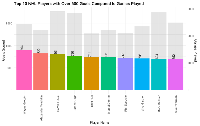
Click Here For Overall PickMy latest data visualization is a scatter plot that compares the number of games played to the goals scored by the top NHL players with over 500 goals. The right-hand side of the plot displays a color scale that ranges from yellow to dark purple, indicating the number of goals scored. The left-hand side shows the number of goals, and the bottom displays the number of games played, with no color scale. The range of the scale bar is from 500 to above 850 goals, encompassing the best players with over 500 goals and those who have recently crossed the 500 mark. The data set represents all-time statistics, and Wayne Gretzky, with 894 goals and 1487 games played, is the outlier on the chart. The scatter plot reveals the interesting relationship between the number of games played and the number of goals scored. While one would expect that players with a higher number of games played would have more goals, the data demonstrates that this is not always the case. By observing the differences in games played versus goals in some players, even those with a high number of goals, one can conclude that the best players are not necessarily those with the highest goal count. Overall, the interactive components of this visualization allowed for further exploration and inspired ideas for other charts. This scatter plot is a valuable tool for understanding the trends and nuances in the NHL's top players' performances, providing insights into the factors that contribute to their success.
Click Here For Top 500 Players| Top 10 Players | Goal As A Percentage | Average Age |
|
|
|
Resources: https://www.kaggle.com https://moneypuck.com/data.htm https://data.world/datasets/hockey https://www.hockeydb.com/